A Totally New Look For My Mantel
As part of redecorating my family room, one thing that I couldn’t wait to replace was the Tuscan’ish print that was over my mantel.
And I am in love with the new lighter and brighter look!
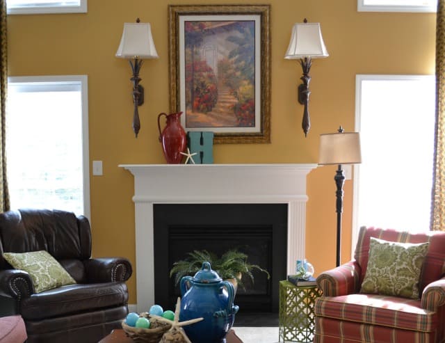
The reds and golds in the old print dominated my family room for far too long and seemed to dictate everything that I put in this room.
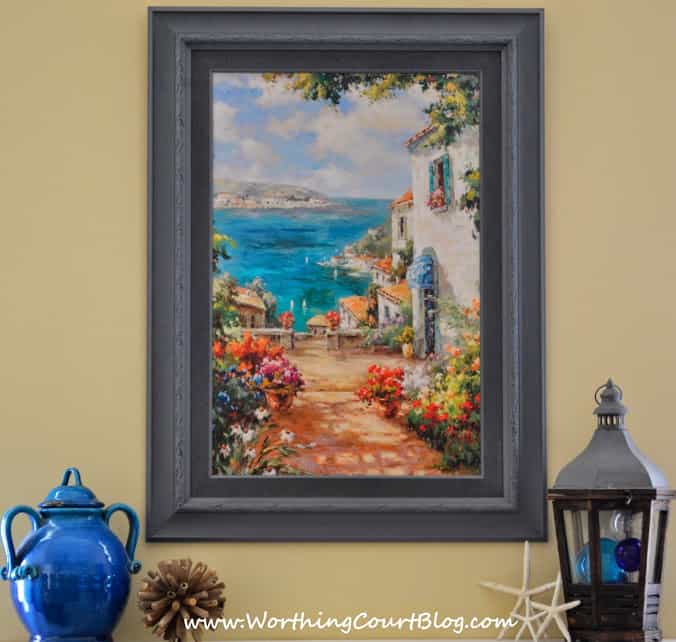
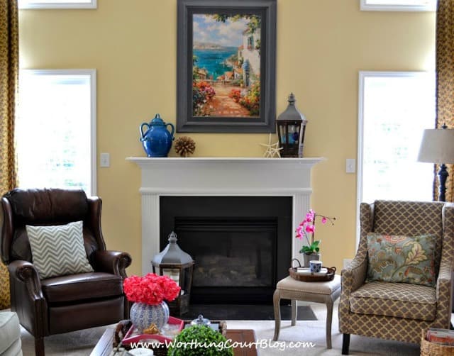
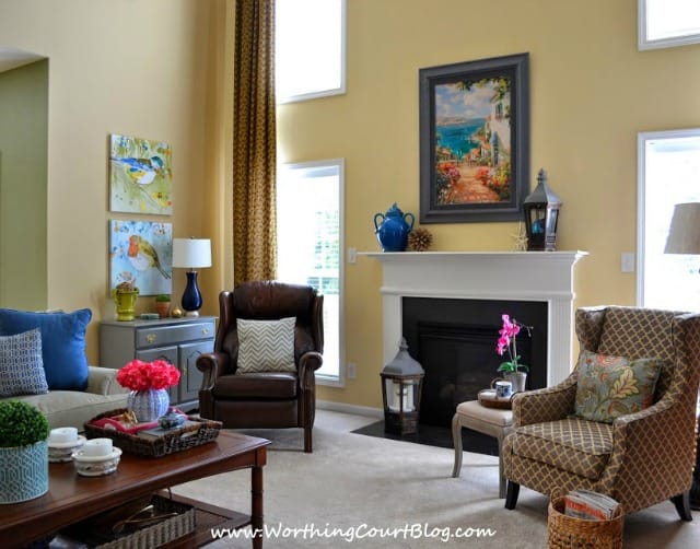
I get quite a bit of pleasure studying this new print. I love the vibrant blue of the Mediterranean water and the pathway that leads the eye toward it.
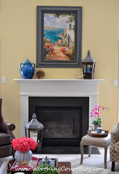
I stole a blue urn from another room in the house for one end of the mantel because I knew that it would do a wonderful job of drawing out the blue in the water.
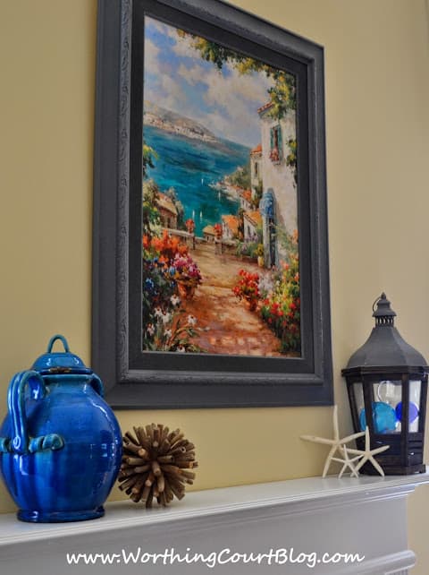
For a summery touch, a trio of starfish is leaning against the lantern on the other side of the mantel. It is filled with clear and blue glass fishing floats. I found them on clearance at Joann’s in case you’d like to buy some for yourself.
A larger, matching lantern is on the hearth filled with a simple arrangement of white candles.
Just like on my front door, I don’t want anything complicated or fussy for summer.
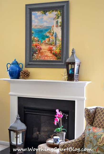
Large artwork can be so expensive, but I saved a lot of money for the artwork above the mantel by reusing the frame that held the Tuscan print and by purchasing a print for 30% off at Art.com. Sadly, I no longer have the link to the print, but you may be able to find it by doing a search on their website for “Mediterranean Village”.
In a few days, I’ll show you my trick for making this print look like an oil painting and how I transformed the frame.
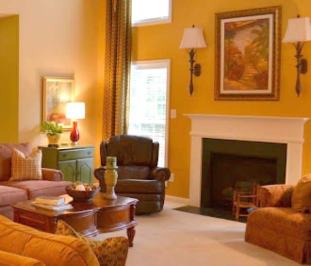
A few months ago, I got rid of the dark gold paint on this wall and painted it match the walls in the rest of the room.
To really appreciate the change, you need to take a look at the before and after.
BEFORE
AFTER
BEFORE
(Sorry for the blurry photo)
AFTER
You may want to check out the other changes that I’ve made in this room.
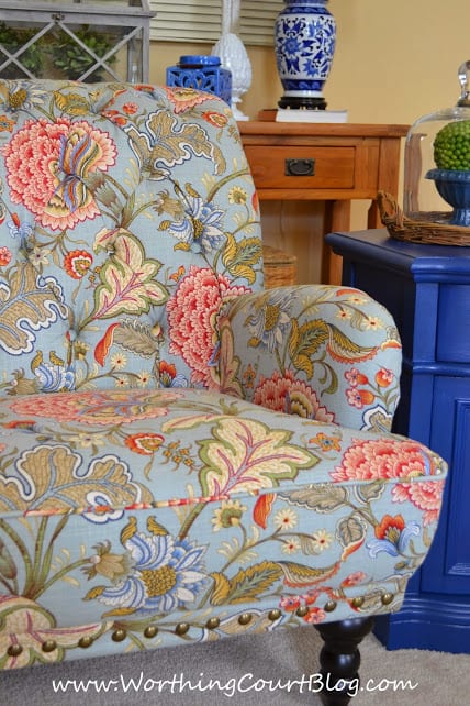
New Chairs And A Chalk Painted Table
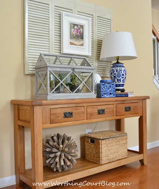
A New Console Table And How To Layer Accessories For A Finished Look
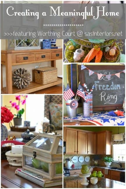
One last thing. I’m visiting with Jenna over at SAS Interiors today sharing my thoughts about Creating A Meaningful Home. My thoughts are from the heart. I’d love for you to check it out.
Thank you for stopping by!
The softer yellow looks beautiful. It is so much better than the darker gold — a fresher look. And I love the painting — good choices.
Thank you, Marisa. I was soooo over the dark gold!
Good job refinishing that frame….you have more patience than I. Loving the other new chairs!!! Guess I missed the post on those. Where did you find your little upholstered side table? Can’t wait to see all this new stuff in the new house!
Glad you like it! The upholstered side table came from HomeGoods. I think it’s actually a stool, but I like using it as a small side table.
Beautiful! I so love your decorating style. The lighter look is a huge improvement and I love all your accessories!
Thank you, Sharon. I’m loving the lighter look too! I no longer avert my eyes while sitting in my family room. lol
Here is that fantastic bright blue again! Yeah for the blue.
Traci
Glad you like the blue, Traci. It sure does change the look of the room.
Love the new print, Suzy. The colors coordinate really well with the bird prints, too. Everything looks fresh and cheery.
Thank you so much, Sheila. I need to find some frames for those bird prints.
Love the changes Suzy!!!…Your beautiful home should sell quickly as the buyers can envision how beautiful their interiors will be too!!
Thank you, Shirley. As tired as I had grown of the red, green and gold, it will be hard for me to leave this room now.
I really love the changes that you have made with bringing the blue out. It gives a very serene feel. in the room.
Stop on over to Anne’s Attic – Design http://fulcolbaxia.wordpress.com and check out the DIY projects.
I need 25 followers to reach my goal. I would love it if you were one of them!
Thanx, Jo
I feel like I have been so out of touch this past month or so. I totally missed your LR reveal. I can’t say enough what a dramatic change it is and how much I love it, but I can’t wait to see it in person hopefully soon! I really love the freshness and the BLUE. xxoo
Thank you, Ladybug. Hoping you can make a trip up soon!
Love the bird prints and wondering where you found them?
Hi Jane. The bird prints came from Pier 1.
Thank you.