10 Takeaways From The 2015 HGTV Dream Home {The Good And The Not So Good}
I know that it has been several weeks since the premiere of the 2015 HGTV Dream Home, but I wanted to spend some time studying it before I commented on it. I recorded the show and have watched it numerous times because I think it’s their best one yet!
The entire home was expertly designed and put together – much beyond what my abilities are. I love the overall casual elegance of the home and have studied it closely to see what inspiration I might find to use in my own home. Here are my takeaways.
#1. Repetition of color ties open living plans together and restrained use of pattern keeps the space from becoming overwhelmed.
It’s easy to make everything white or neutral, but it’s the repetition of color and the use of pattern that keeps the room from looking flat and unappealing. The use of pattern is restrained so as not to overwhelm any one area of the space.
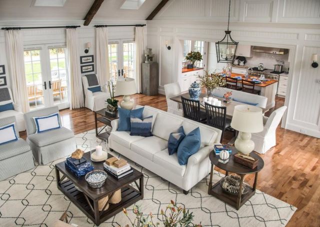
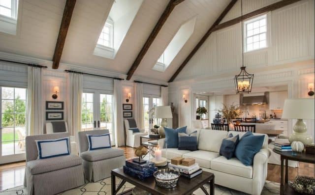
The lanterns in the corners of the family/dining room are totally cool, but I would have preferred to see them hanging from brackets of some kind. The pedestals in each corner feel contrived and too heavy.
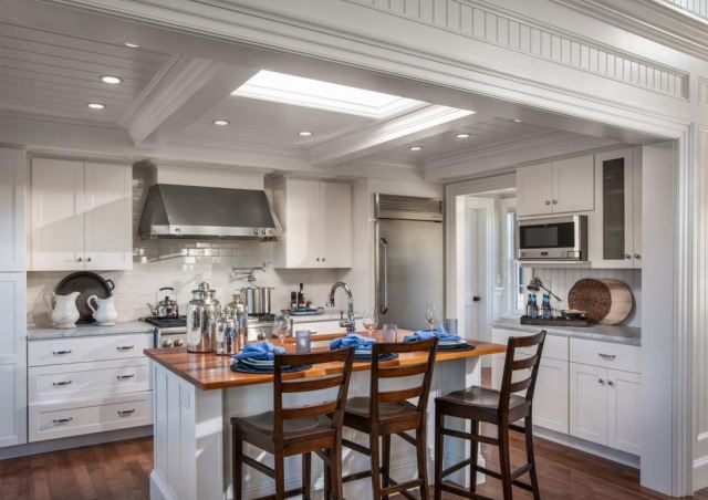
#2. Every white kitchen needs a bit of brown to warm it up and make it inviting.
Whether the brown is in the form of countertops, furniture or accessories like cutting boards and trays, an all white kitchen can easily appear to be too sterile and cold.
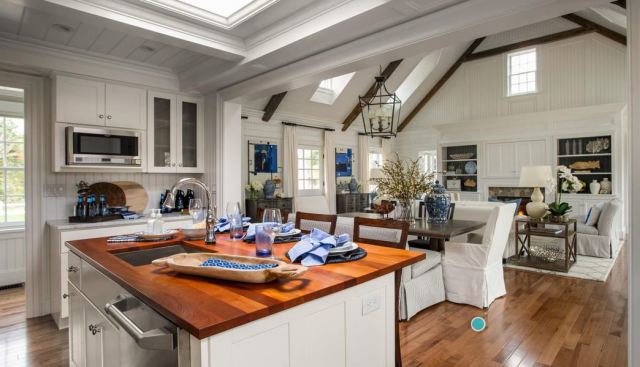
But as absolutely stunning as the Dream Home kitchen is, I don’t especially care for the surrounding opening. It think it makes the kitchen look like it’s tucked into a huge closet or nook.
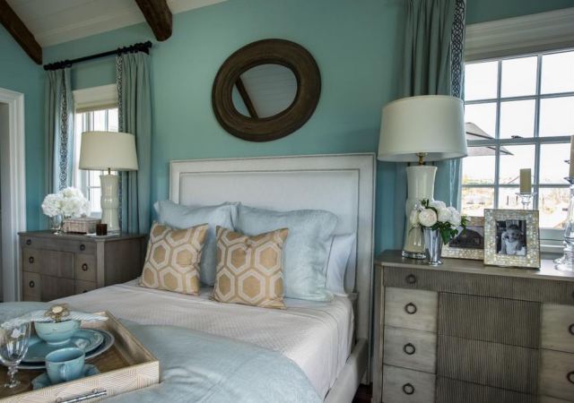
#3. Bedside tables don’t have to be the same height as the top of the mattress.
I love using small chests as a bedside table, but have always operated under the assumption that they ought to be close to the same height as the top of the mattress. The chests used in the Dream Home are quite a bit taller. The room wouldn’t feel nearly as grand to me if they were several inches shorter.
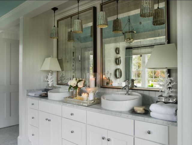
#4. Treat your master bathroom like the special place that it is.
No matter how large or small your master bathroom is, there are luxurious and spa-like touches that can be added to make it feel like the special room that it is. After all, it’s the place where you ready yourself every day! I don’t have the budget for an elegant slipper tub or an awesome barrel ceiling, but I can add small things like a pretty rug, pretty soap pump or pretty hand towel.
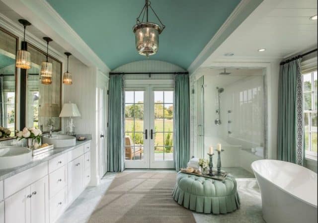
As gorgeous as I think they are, I wouldn’t want aged mirror glass above my sinks though. I want and need a clear view of myself in the mirror when applying makeup, etc. I think these mirrors should be used in a different area of the house.
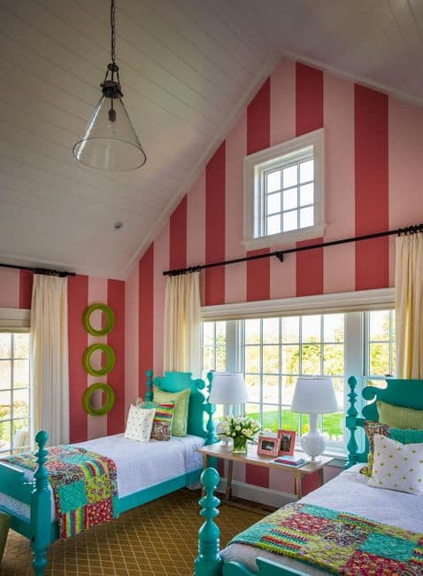
#5. Don’t be afraid of color, especially in a children’s space.
Use lots of color and playful pattern to appeal to the natural lightheartedness of children. I will admit though, that these stripes are a bit much for me.
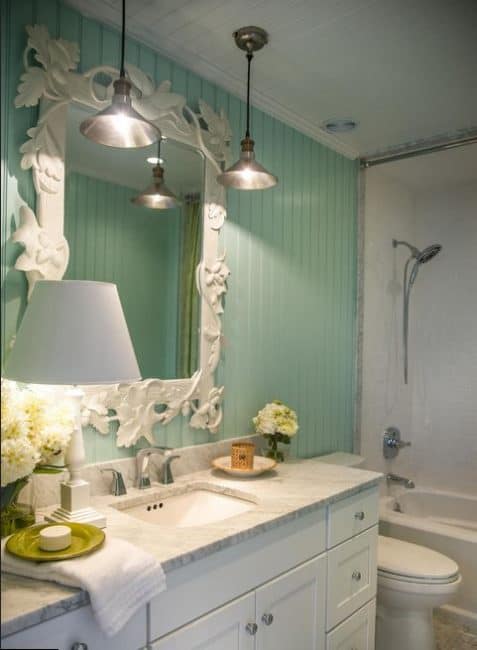
6. Use unusual light fixtures where you least expect them.
I would expect to see some sort of light fixture attached to the wall either above the mirror or on each side of it. Without the adorable galvanized pendants in the pretty children’s bathroom , it would be, well, just another pretty, but slightly boring, bathroom.
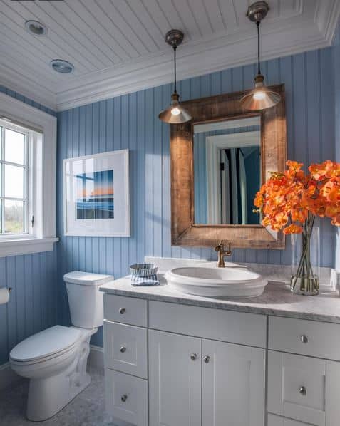
Here they are again in the guest bath.
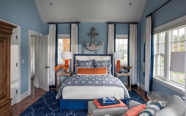
#7. Rooms with a monochromatic color scheme look best with a few pops of color.
Imagine how boring this room would be without the pops of orange. Without it…yawn. With it…perfect!
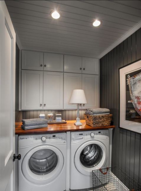
#8. The smallest of laundry rooms can be made inviting when loaded with eye-catching features.
Even a laundry closet can be lined with beadboard and painted a dramatic color.
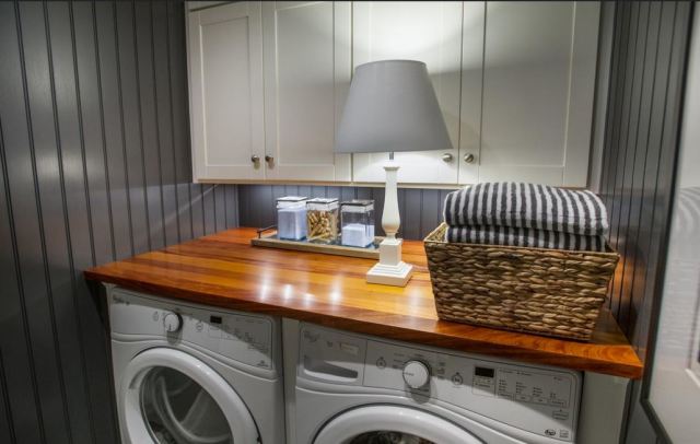
But, it would be annoying to me to have to move something out of my way every time I needed to access one of the machines.
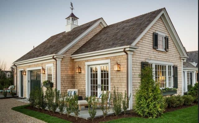
#9. Don’t ignore a shed and treat it like it isn’t a part of your property.
Don’t ignore any type of outbuilding that you may have, even if it’s something as simple as a storage shed. The addition of a cupola and some pretty landscaping is what it needs.
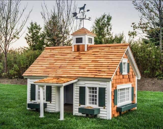
10. And last, but not least – I now know that my furbabies need a dream home too!
So, what are your thoughts about this year’s HGTV Dream Home? Did you love it or did you think it was only ok? Did you have any favorite takeaways of your own?
Suzy, you made so many good points. To add my two cents….I think the master bath is too big and the laundry room is too small.
I totally agree with you, Kate. To be honest, I was surprised the whole house was as small as it is – in terms of number of bedrooms.
I really enjoyed your comments, and I saw aspects of the rooms I wouldn’t have noticed before. I think the bedside chests heights are visually fine, but I can’t imagine reaching for a tissue without whacking my arm on the side…Practicality wins in my house, so I’d go with lower chests.. 🙂 LOVED the “shed”!
Haha…same here, Babs. In fact, I’m afraid that I’d whack my head if I got up during the middle of the night. I imagine that a lot of what they do is for styling’s sake. Oh and that shed? Swoon.
I loved this years home. I am not normally a blue fan but I think the colors are perfect for this home, given the location.
I think you’re right, Penny. Wish I knew how close the house actually is to the water though. On the show, it looked like it was built on a piece of former farmland.
I think I would agree with most of what you mentioned here. When viewing this home in magazine layouts and other bloggers’ posts, some of the things that screamed out to me were: the kids’ bedroom – too much color in those stripes (unless you’re at the Greenbrier with Carleton Varney or his predecessor, Dorothy Draper), too many windows for kids (after all, you don’t the boogie man to just be able to come and go from so many options, right?). The lamps on the laundry and master, kids’ bath counters – just NO. And just imagine kids (or even adults) coming through those French doors and banging them against those chunky blocks…crash, goes the glass in the doors. Lastly, I personally would have the animal house a little bigger and let the animals join me in the GARDEN shed. But, then again, HG didn’t ask my opinion, lol.
Rita C at Panoply
Yeah, that girl’s bedroom was a too overdone, although I liked the color combo that they used. I was surprised to see such a colorful and busy room when the rest of the house was relatively subdued. I assume that a lot of their choices, (lamps, etc) were done for styling purposes. That master bathroom vanity was awfully crammed full of stuff.
Great post, Suzy! You always teach me so much!
Glad you enjoyed it, my friend!
I love love love this gorgeous home. Thanks for pointing out all its beauty! I’m entering to win everyday!
I hope you win, Yvonne! You’re a lot closer to it than I am. lol
Love this house… I agree..the stripes are too much in this house. I’m getting tired of too much white in all of kitchens shown now. Boring….
The stripes just seemed out of place based on how the rest of the house was decorated. I know that one of the “rules” of design is that a house should flow from room to room, but this room didn’t seem to fit it with the rest of the house at all. Maybe they were using the ‘rules are meant to be broken” theory. lol
This was a fun post…I’ll take all of your suggestions to heart when I win…hehe! You did bring up some great points…you obviously watched that show much more than I did! I was surprised it only had a one car garage…not enough storage! 😉
I know, Donnamae. I was wondering if there was another garage somewhere that they didn’t show us. Why would you build such a wonderful house with only one garage???
I agree that the laundry room is too small because it’s about the size of mine. ): Love the paint colors, but the one bathroom had very little counter space & I much prefer sconces to pendants over my mirrors. It would annoy me with them hanging in front of my mirrors. I do like the little lights on the sides of the wall in the family room, but totally hated the pillar of wood in the corner…I don’t get that one at all!
Oh, and I hated the stripes, but loved the painted beds.
Excellent points! The aged windows in the bathroom are puzzling to me. Who WOULD like that??? Overall it’s amazing house with unending beautiful details.
What really surprised me was the use of curtains on the front door. In the photos, the curtain appears to be in the way of the door swinging open and closed! Can you imagine what will happen when the wind catches the drape? I get that they were hung to keep the door in symmetry with the flanking windows/curtains, but it just isn’t practical.