House Tour: House Snooping at the Traditional Home Magazine Showhouse
I have a surprise House Snoop for you today!
I recently had the opportunity to tour the fabulous Adamsleigh estate hosted by the Junior League of Greensboro, NC with Traditional Home as the national media sponsor.
Sophia’s
Plans for this magnificent, sprawling 15,000 square foot home were finalized in 1929 and the home was christened by the family in 1931. Yep – right smack in the middle of the depression.

Junior League of Greensboro
Rooms were designed by well known designers Miles Redd and Suzanne Kasler along with many others both local and from around the country.
Sophia’s

Sophia’s
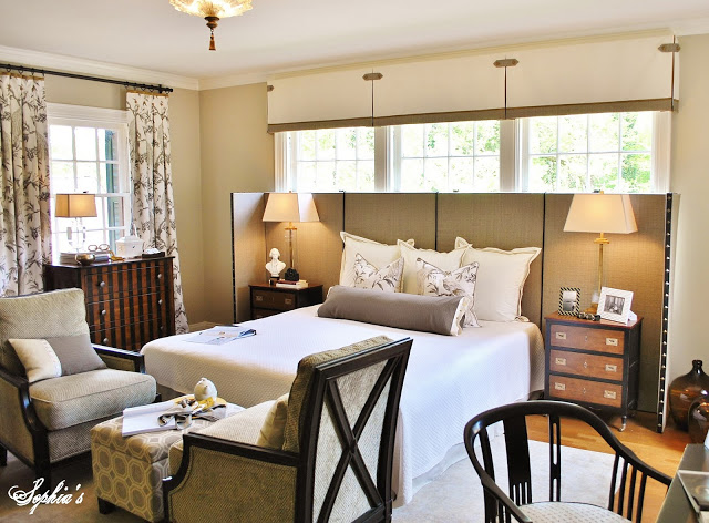
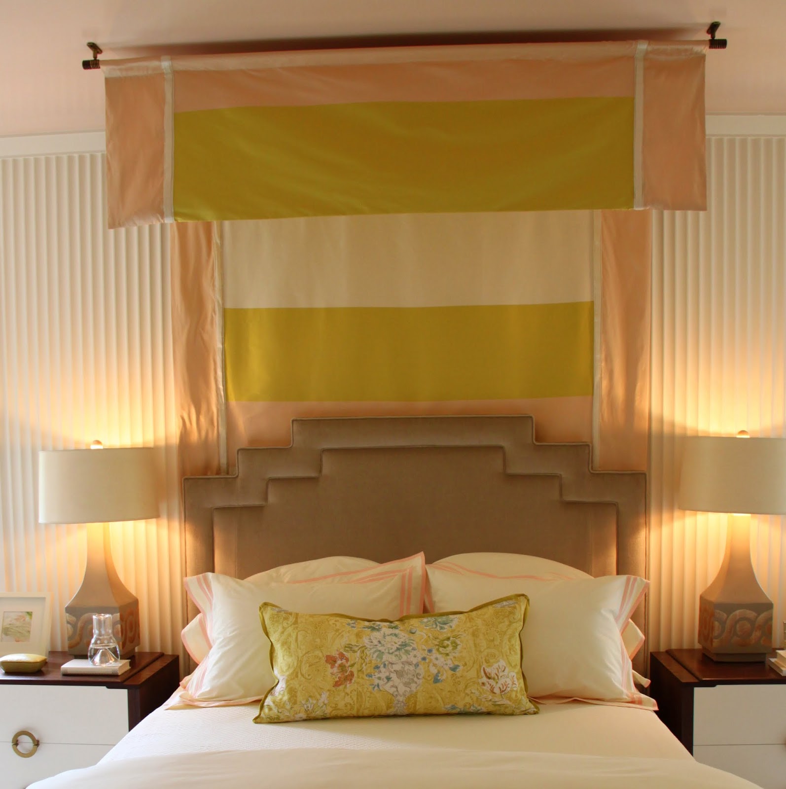
Upholstered panels were used in this bedroom to create a backdrop for the bed in a room that had either doors or windows on every single wall.
Sophia’s
Although repairs had to be made, most of the woodwork and plaster is original to the home. Check out this plaster ceiling. Amazing!

Sophia’s
Tucked behind this curtain were steps leading up to a tub with a mural on the wall.

Southern Hospitality
I was pleasantly surprised at what a great job the designers did turning this into the type of home that I could easily visualize a modern day family living in.
Southern Hospitality

Southern Hospitality
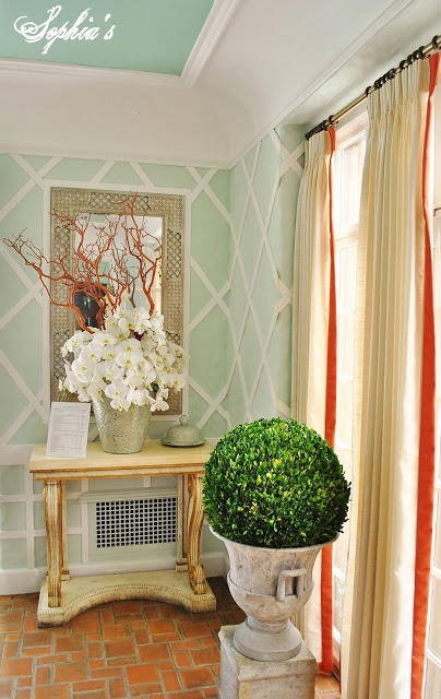
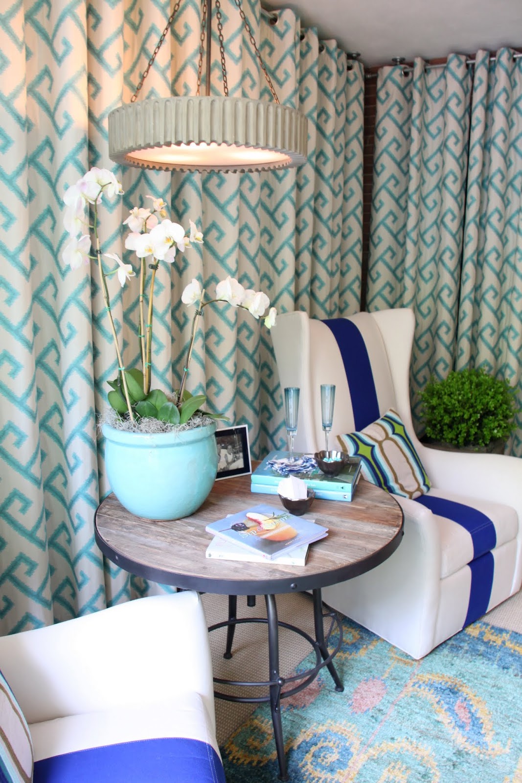
The sunroom was one of my favorites. At first I thought this was wallpaper, but it is actually strips of lattice applied to the wall.

Southern Hospitality
Just one of the many outdoor areas surrounding the home.
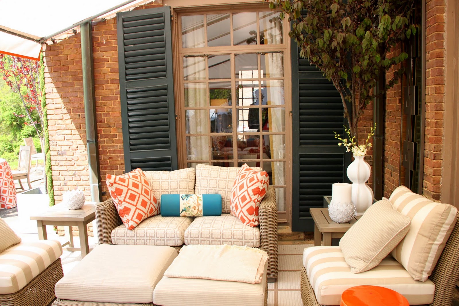
Southern Hospitality

Southern Hospitality
The kitchen is the one area that was pretty much just cleaned up and left as is. Someone commented that the green tile reminded them of an old time insane asylum.

Southern Hospitality
One of the designers did create this inviting eating space in one of the kitchen nooks though. I suppose this is where the servants were supposed to eat. 😉

Southern Hospitality
Southern Hospitality
Southern Hospitality
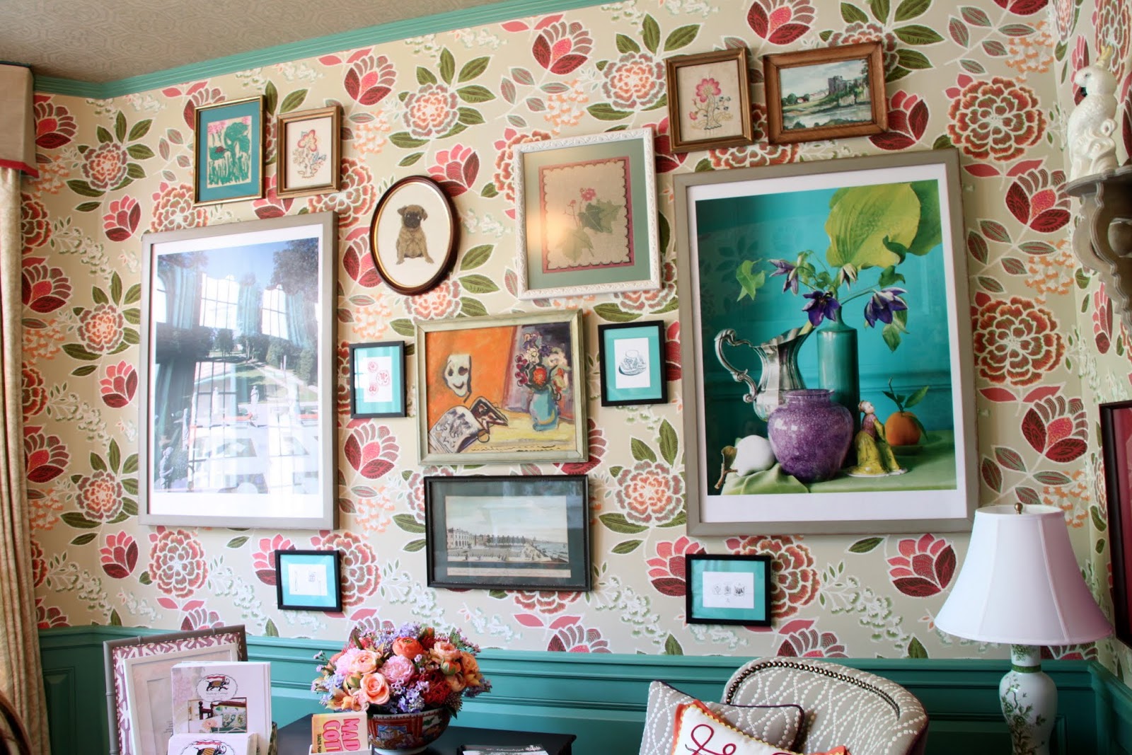
Another original plaster wall. Truly amazing.
Southern Hospitality

Southern Hospitality
I don’t know if you can tell or not, but the wallpaper print looks like architect sketches. This bath was black and white with pops of emerald green, like this ribbon and nailhead treatment around the door.
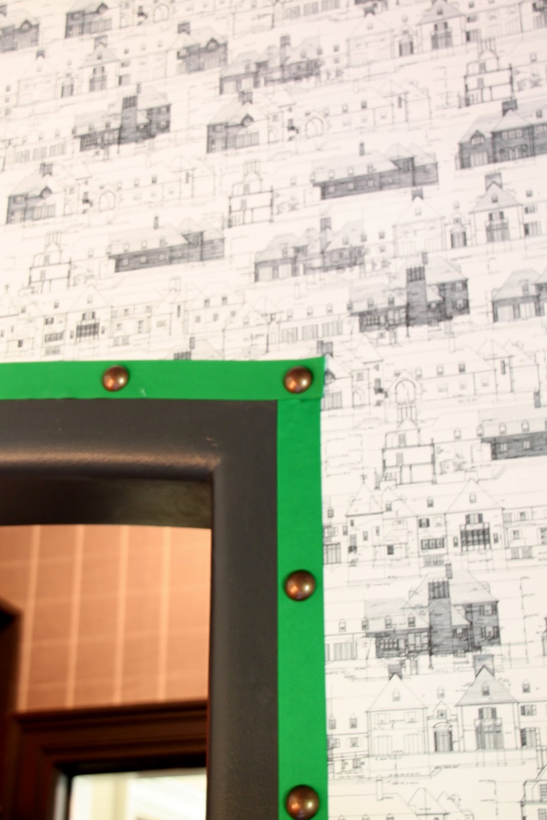
Southern Hospitality
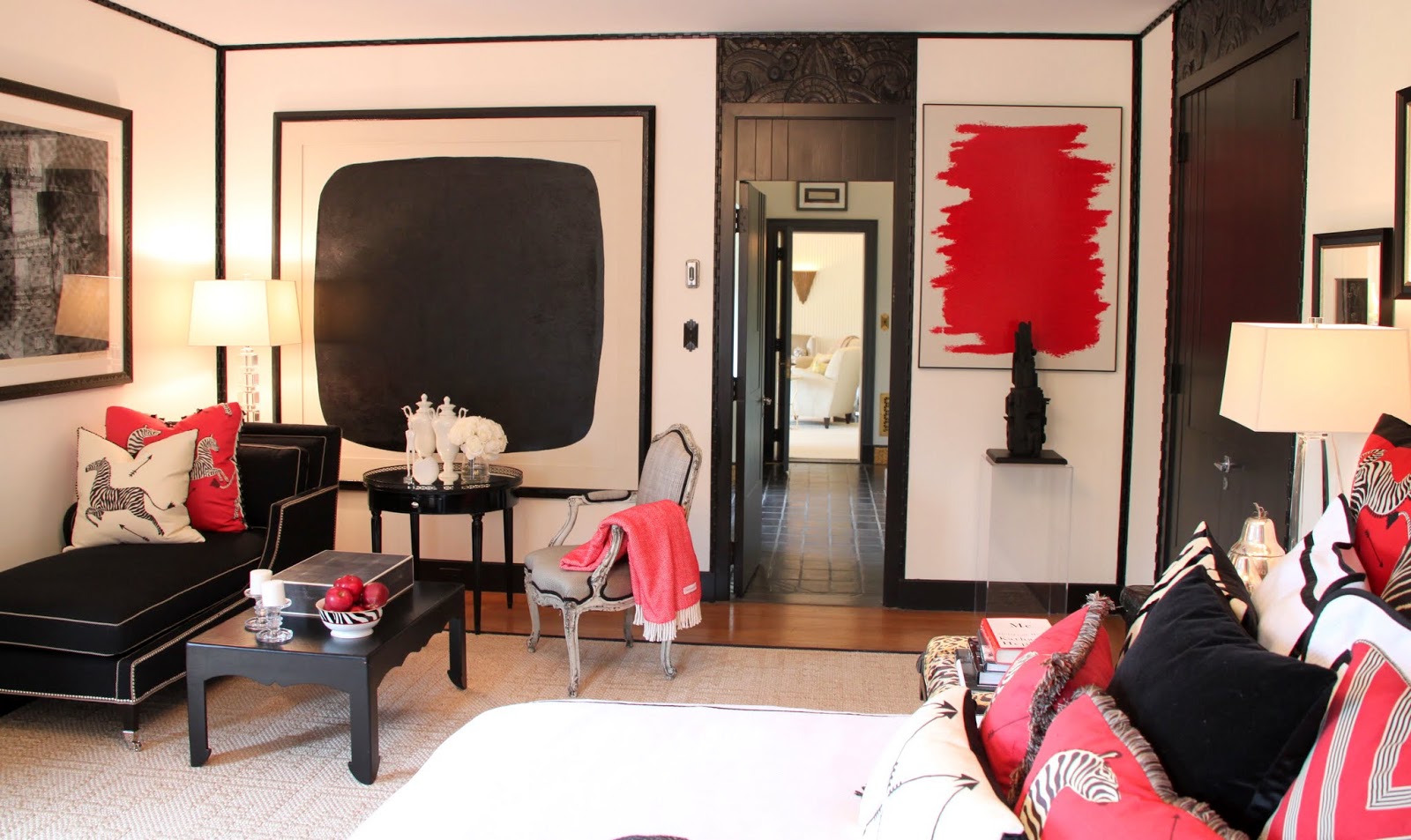
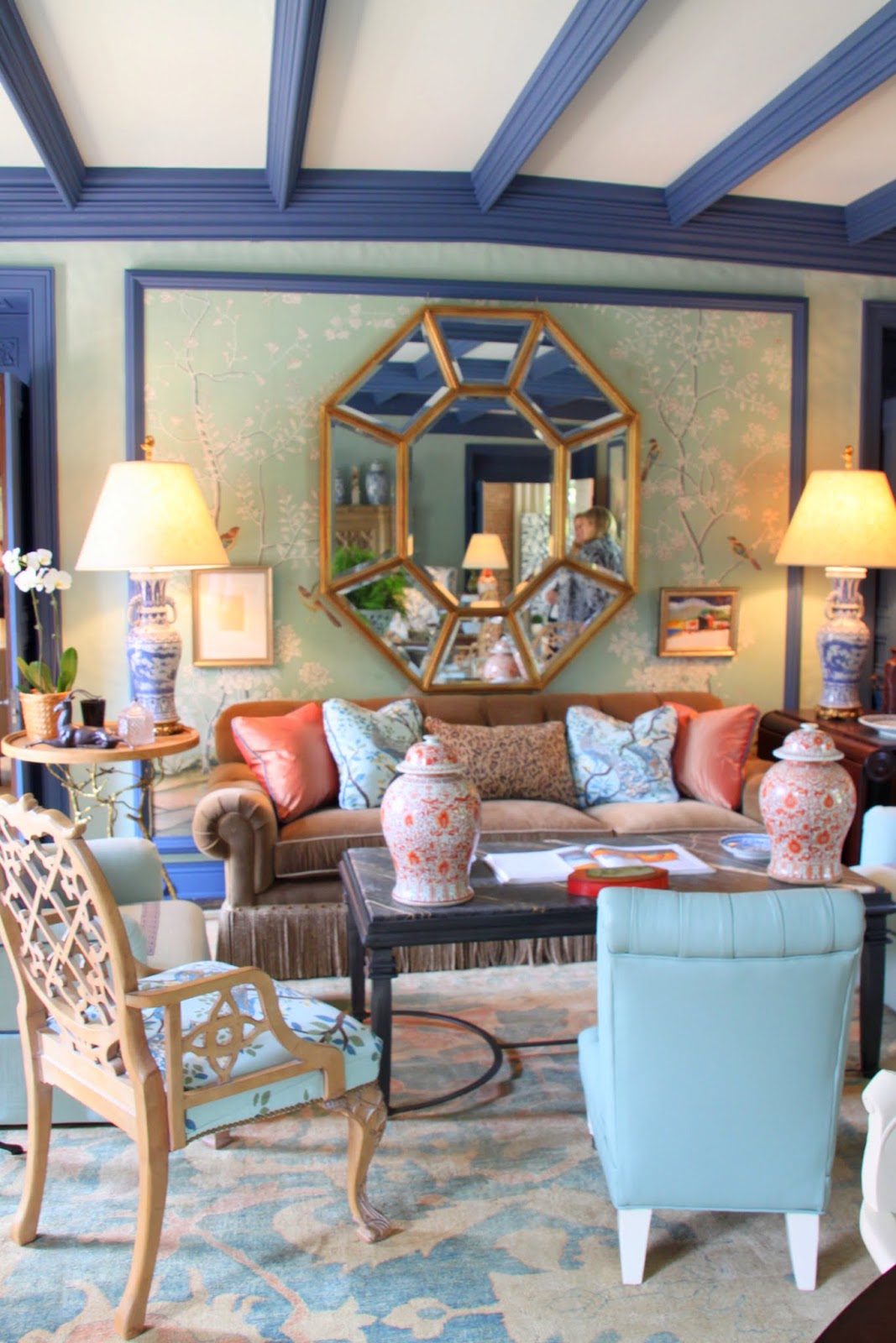
I’ll end with a picture of the fabulous living room that was designed by Miles Redd. I’ve forgotten how many tens of thousands of $$$ we were told the rug cost.
Southern Hospitality
If you’re local or planning to be in the area, I highly recommend a visit to this amazing estate.
A HUGE thank you to Kristen from Sophia’s and Rhoda from Southern Hospitality for loaning me some of their photos! That’s because a certain blogger, ahem – me, forgot their camera. Thank goodness for the kind generosity of sweet friends.
Great minds. I blogged about Adamsleigh today too.
Incredible! But I agree with the comment about the green kitchen, the green tile is ugly.
This some sprawling place, I love all the woodwork and the plaster. Beautiful! Have a great weekend.
Cynthia
I loved this tour…so much that I am going back again with friends from the neighborhood!!
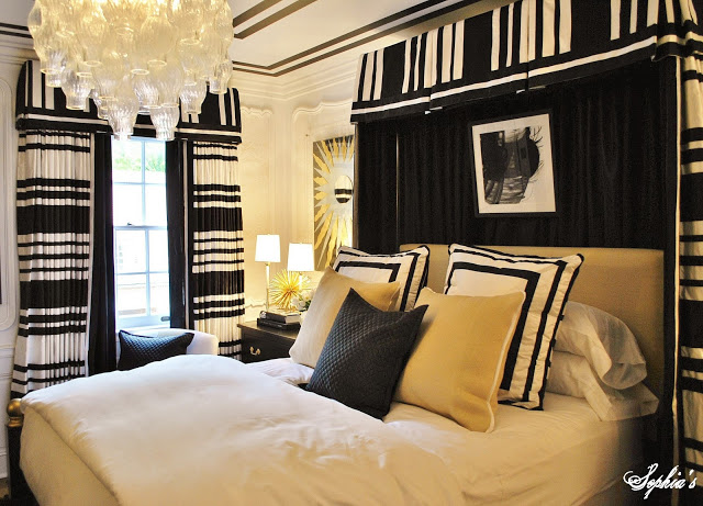
My favorite this is the black and white horizontal striped draperies. I bet you had a ball looking at the window treatments and linens.
The green tile in the kitchen was to remind the servants where they would wind up if they didn’t do right. LOL!
Have a great weekend, Ginger
The decor of this house surprised me! I wasn’t expecting such a modern take on this old estate. I loved all the wallpaper and bright, bold treatments! The green tile walls reminded me of a hospital though, the eating nook would be so much more inviting if that was changed! Thanks for a fun tour,
Jenna
Love this tour!! Every room is so different and unique:)
xo
amy
http://www.theblissfulbeeblog.com
Suzy, thank you so, so much for brightening my day with these images. The color palettes the designers used are perfection. Really a livable home!
PS I am having a Paris Book Giveaway!
xoxo
Karena
Art by Karena
Toured Adamsleigh on Friday with a group of friends. What a fun day! Many in the group have been involved from the start as members of Junior League. They said the transformation was unbelievable as the house has been empty for a while. The wallpaper you were mentioning was actually the architectural drawings of Adamsleigh. The plaster ceilings in the library and dining room were amazing. Woodwork was gorgeous too. Wish someone would buy it, turn it into a bed and breakfast and/or event venue…..what a gorgeous place for a wedding! Wish I had visited when you were there…would have loved to run into you, Rhoda, Kim and others!
Honestly one of the biggest messes of room designs that I have ever seen. Sad that the home was torn down though.
I agree. Some of the rooms were well done, but there was absolutely no cohesiveness throughout the house at all.