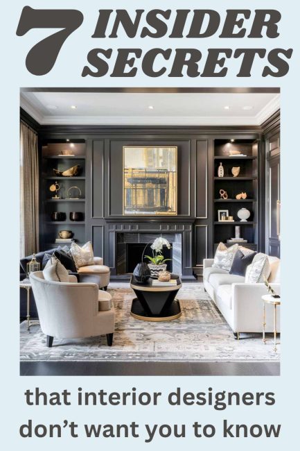
Interior Design Principles that the Pros Don’t Talk About
Ever wondered what separates a professionally designed space from your average DIY effort? It’s all about knowing the insider secrets that designers swear by but rarely share.
Let’s face it, diving into the principles of interior design can be about as thrilling as watching paint dry. But hang on ’cause I’m here to spill the beans and have a little fun along the way!
We’re going to quickly look at seven key design principles that the pros use to create those stunning, cohesive rooms you see in magazines and in designer showhouses.
These tips are so effective, you might just feel like you’ve hired a top-notch interior designer without spending a dime. So, buckle up and get ready to transform your home with these must-know secrets!
Welcome to chapter 7 of the Simply Decorating Series; a free resource designed especially for the diy decorator who is eager to transform their home into a place that reflects their personal style and needs. Each post breaks down complex design ideas into simple, actionable steps. If you’re just beginning the series, start with chapter 1, How to Decorate a Room – Where To Start.
First, I want to point out…
This is where the importance of creating a mood board comes in. It’s such a valuable tool that you should regularly refer to as you make purchases and design decisions.
Don’t look at it as a chore to do. Think of it as a fun puzzle that you’re putting together – not a rocket science exam.
Also, don’t rush the process; allow your space to evolve organically, which can make decision-making less overwhelming and more intuitive.
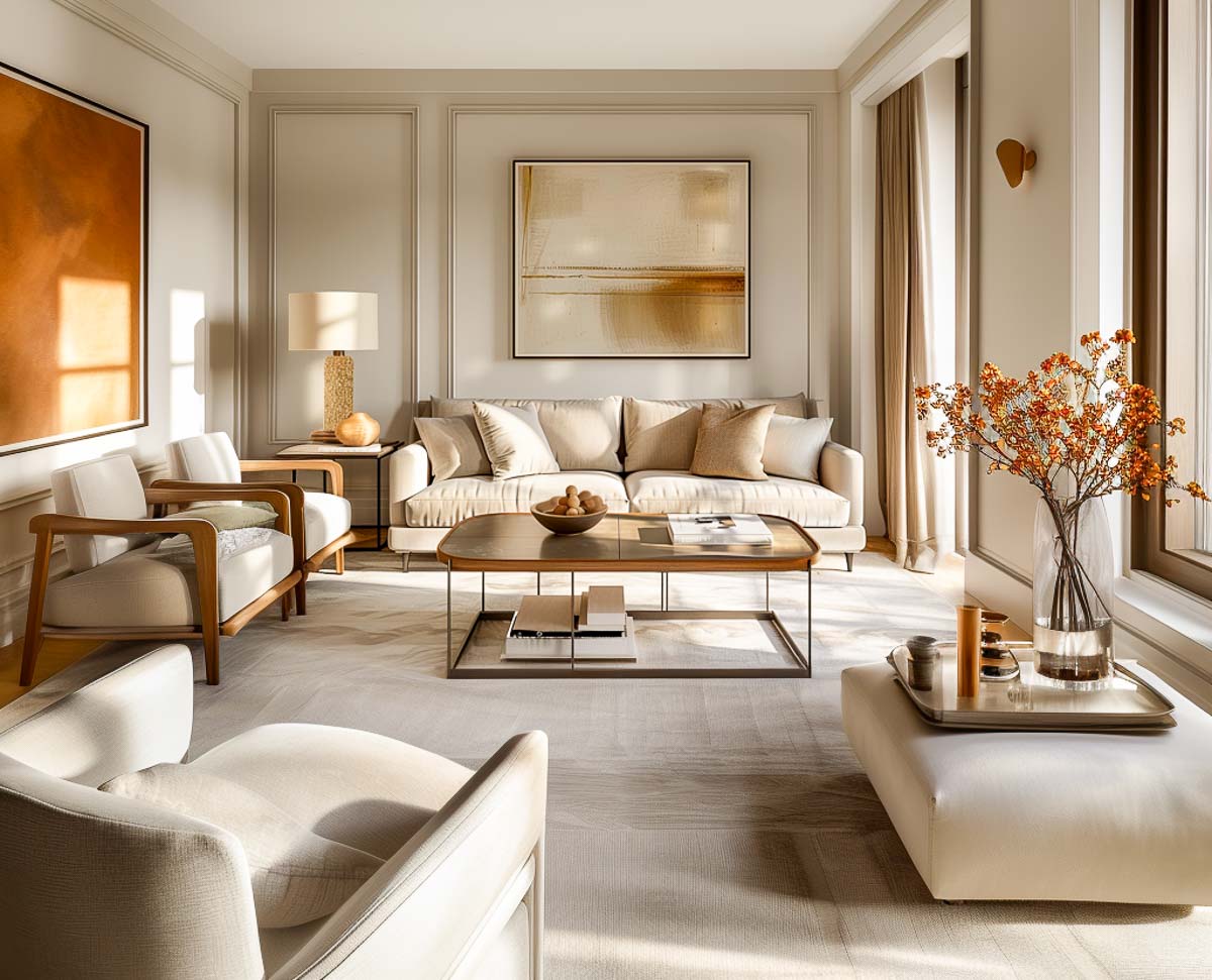
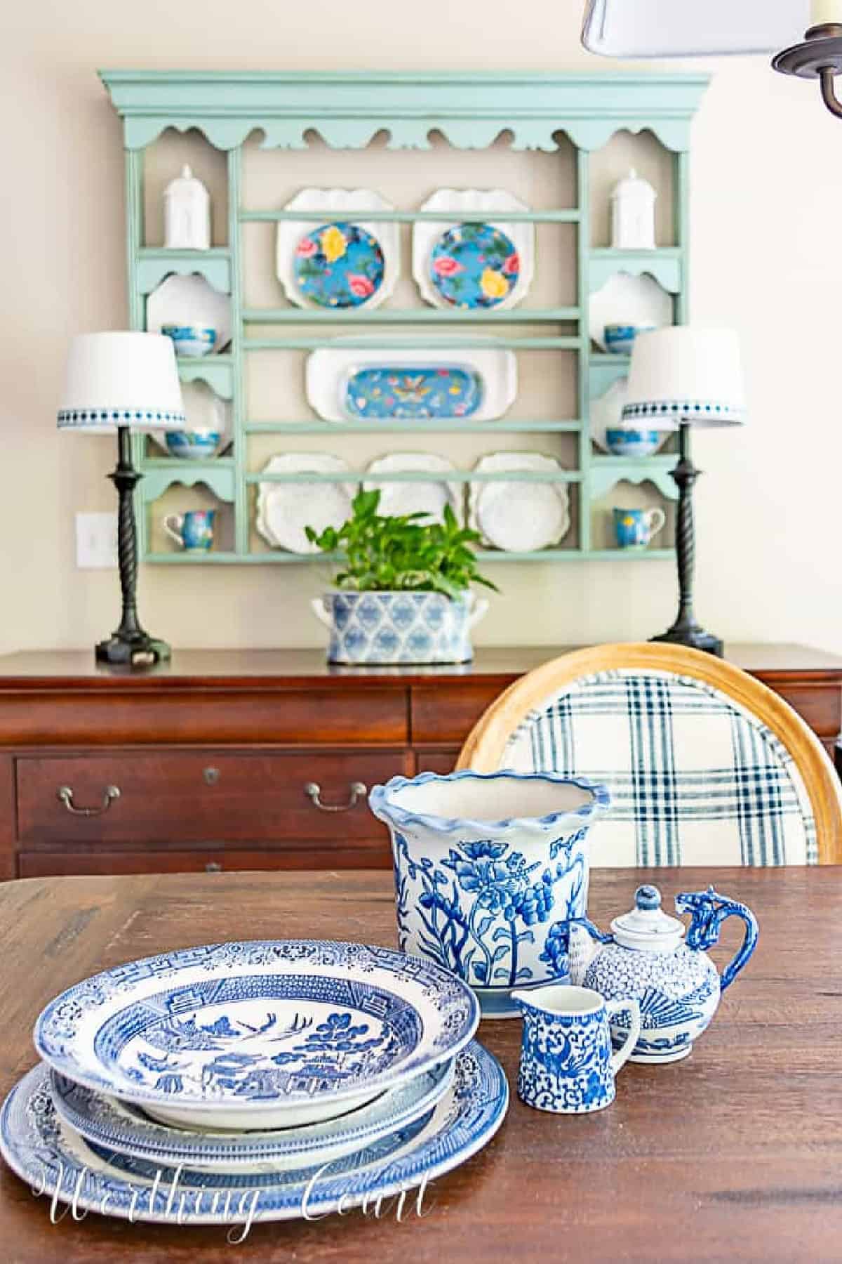
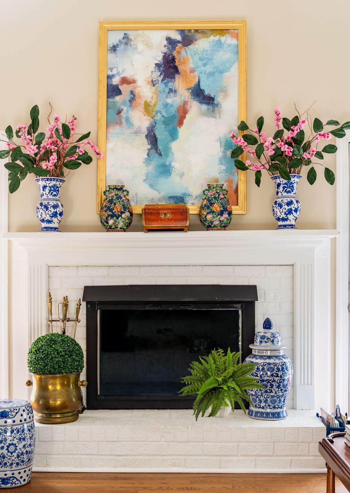
Unity & Balance
Unity and balance in interior design is simply the harmonious blending of elements to create a cohesive and balanced look throughout a space.
Without it, your home might end up looking like a quirky thrift store explosion—interesting, but not exactly harmonious.
It’s accomplished by carefully choosing and repeating certain design elements, such as:
- a consistent color palette across different rooms
- use of similar materials and textures
- use of patterns that echo one another in various spaces, whether through upholstery fabrics, rugs, or artwork.
The goal is to ensure that each room retains its own unique features, while still fitting into the overall design.
Here’s a simplified example. Let’s say that to create a base, you used a neutral color palette of beige and whites throughout your home.
To give rooms their own unique features, you might add blue accents with pillows and a rug in the living room, and in the bedroom, use soft green tones in the bedding and artwork.
Both rooms maintain the same base colors and textures, while the different accent colors give each room its own unique character.
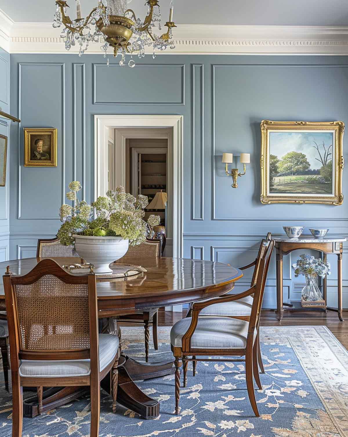
Emphasis
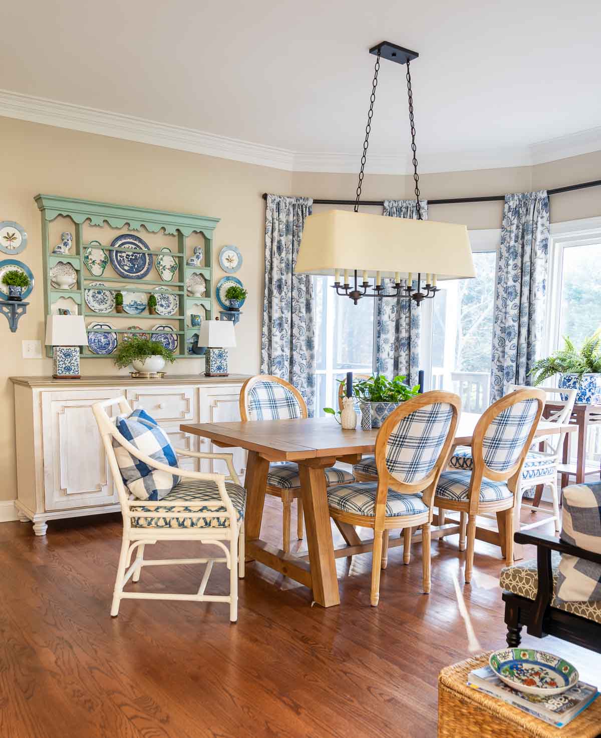
Let’s talk about emphasis in interior design—because every room needs that one fabulous piece that struts in and says, “Look at me!”
Emphasis, as it pertains to interior design, simply means creating focal points with standout elements like bold furniture, vibrant art, or unique architectural features.
Things that will draw the viewer’s eye and enhance the room’s overall aesthetic appeal.
When properly executed, emphasis not only adds visual interest but it also helps to anchor the design.
An example of emphasis in action might be a dining room where a stunning chandelier hangs above the dining table, immediately drawing the eye. The table, chairs, and surrounding decor are more subdued, which ensures that the chandelier is the star of the show.
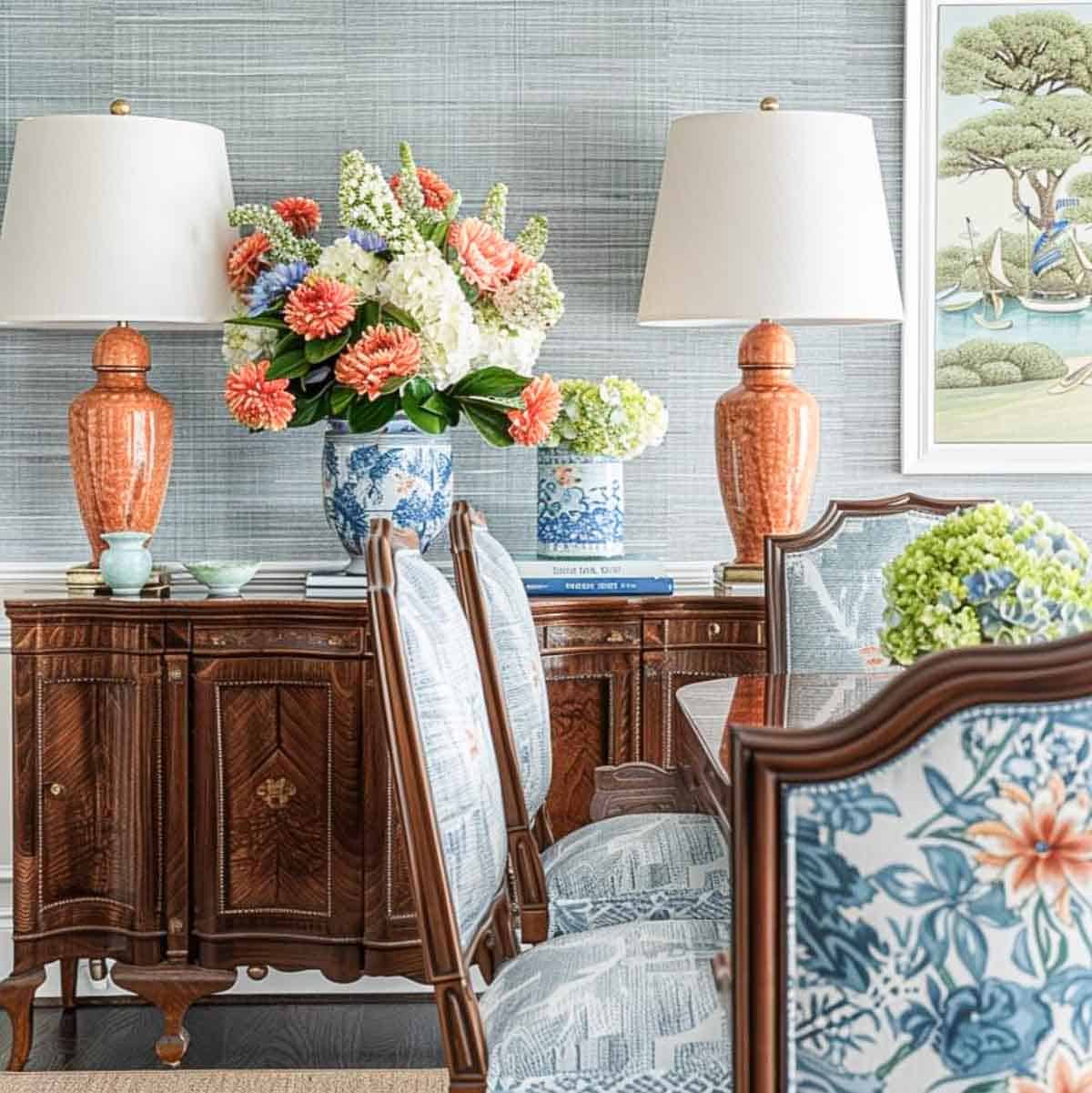
Contrast
Without contrast, your space can end up looking like a monotone painting—pleasant but flat.
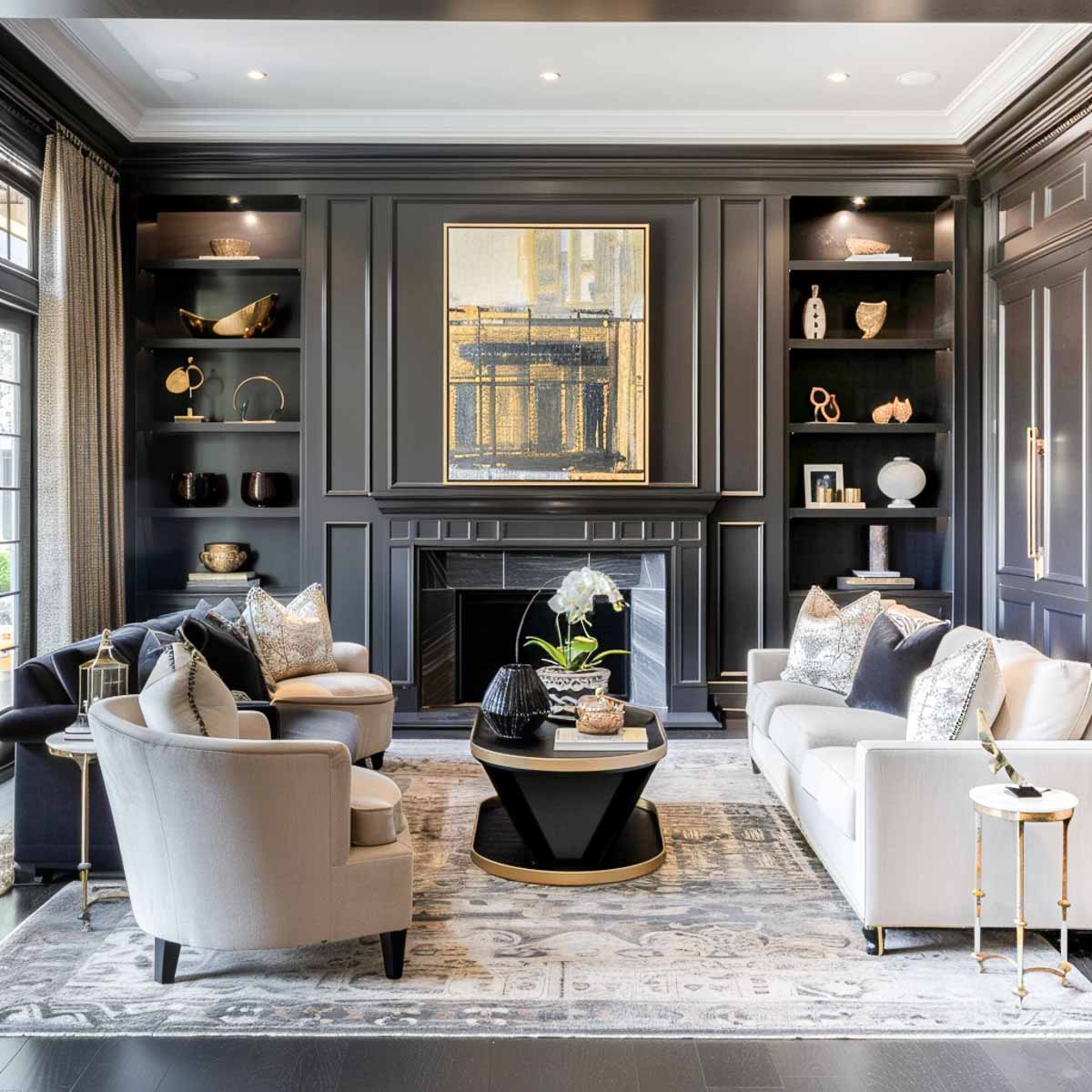
It’s an important design element because it adds depth, visual interest, and a sense of balance to your room.
Whether it’s through pairing bold colors, mixing textures, or combining different shapes and sizes, contrast ensures your design is dynamic and engaging.
Think of it as adding a little bit of spice to your favorite dish; it’s what makes everything come alive!
It isn’t just using contrasting colors. Using a bedroom as an example, look at the ways you can add contrast to a room:
- Pair a navy blue accent wall with crisp white linens and light colored furniture.
- Contrast textures by placing a plush velvet headboard against a smooth painted wall and incorporate metal lamps to juxtapose with wooden nightstands.
A combination like this, of dark and light colors, different textures, and various materials creates a visually engaging and balanced room.
Design Rhythm, Repetition & Movement
Alright, let’s get jazzy with design rhythm, repetition, and movement—because who knew your living room could have such smooth moves?
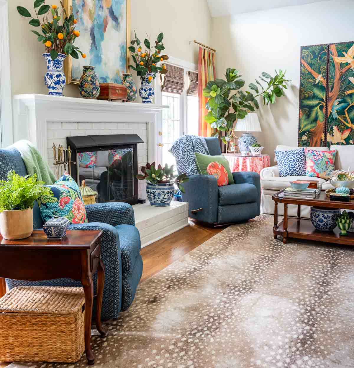
This principle is all about creating a visual beat that guides the eye smoothly through the space, like a well-choreographed dance routine.
The rhythm is when you create a visual flow that guides the eye through a room, with the repeated use of design elements like color, texture, or pattern at regular intervals.
Repetition strengthens the design by echoing these elements throughout the space.
And movement is the path the eye follows around a room, orchestrated by strategically placing attention-grabbing elements that lead the viewer from one area to another.
Imagine a living room with a boldly striped rug.
- The rug sets the rhythm with stripes that guide your eye across the floor.
- Repetition happens when the colors from the rug are repeated in throw pillows and artwork throughout the room.
- Movement is created by strategically placing a brightly colored, eye-catching armchair or two in the room.
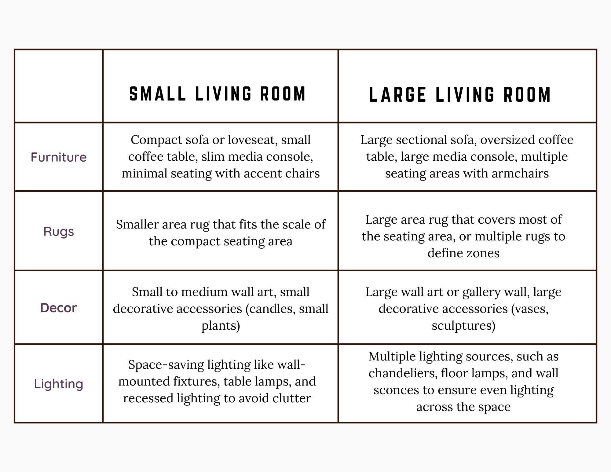
Scale & Proportion
Don’t think that these two terms have the same meaning.
Scale refers to how an item relates to the size of the room and proportion involves the ratio of design elements to one another.
Filling a large room with tiny furniture can make you feel like you’ve stepped into a giant’s lair that had a tiny fairy for a decorator.
Conversely, using large furniture in a small room can make it feel cramped and overwhelming – like trying to stuff a sofa into a small closet.
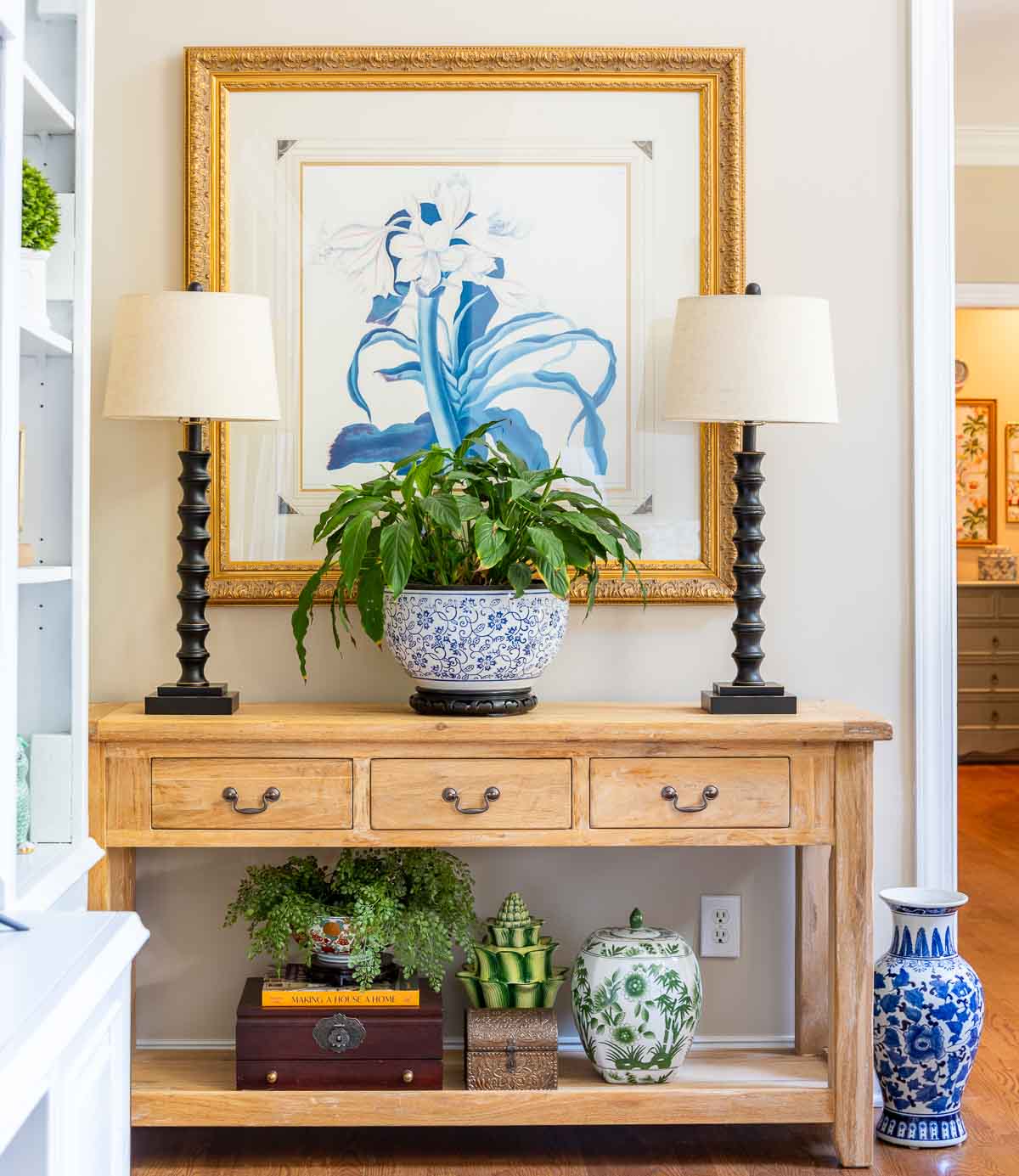
Negative Space
Sometimes, it’s not about what you put in a room, but what you leave out! Think of the use of negative space as giving your furniture and decor some personal space, so they don’t feel like they’re at a crowded concert.
Those empty areas, around and between objects in a room, are the key to helping to emphasize the important things and prevent a cluttered look in a well designed space.
Designers often use negative space to highlight architectural features, create a focal point, or simply provide breathing room, making the space feel more expansive and luxurious.
It’s especially important in smaller rooms where you often have to create an illusion of space.
Take the question of how much artwork should be in a room. Should every wall have something on it? Not necessarily!
In fact, leaving some walls bare can be a smart design choice. By not filling every wall, you create negative space that allows your chosen pieces to stand out and prevents the room from feeling cluttered.
Details
The type of details that this design principle refers to isn’t about the accessories in a room. It’s kind of like getting into the nitty-gritty of decorating.
The sort of details this refers to includes things like the selection of textiles, the style of finishes, and the quality of craftsmanship.
For example, choosing a distinctive cabinet handle or a unique baseboard style can subtly enhance the room’s overall aesthetic.
Some of the details that you’ll want to consider are:
- the style and amount of trim and molding
- hardware, such as drawer pulls, cabinet knobs, and door handles
- the correct sheen of paint for the room
- the best type of window treatments for the room
- floor details such as inlaid patterns, carpeting, and transitions between different types of flooring
- ceiling treatments such as coffered ceilings or exposed beams
- staircase details like baluster, railing and newel post style
- door styles can range from flat to paneled
The list could go on and on, but I think you get the idea.
So there you have it, the list of what’s officially known as the “seven principles of interior design”.
Who knew that something as mundane as negative space or design rhythm could be so important in creating a stylish and cohesive home?
Remember, even though these principles might seem a bit dry, they are the secret sauce that transforms your DIY projects from “nice try” to “nailed it!”
So, as you embark on your decorating adventures, keep these tips in mind. And don’t forget—it’s your home, so have fun with it! After all, the best design is one that makes you smile every time you walk through the door. Happy decorating!
Next in the Simply Decorating series: how to get a cohesive look when you decorate.
To follow along with the Simply Decorating Series, sign up for my emails.
Thank you for this article. I have enjoyed all of your posts, but this one really struck a cord since I am about to tackle updating a few rooms. I love how you organized and presented each step with clear and simple explanation, examples and photos. I find redoing current spaces to work with existing rooms almost more intimidating than starting from scratch. This article helped me get the perspective I needed.
Hi Lynn. I’m so, so glad that you found it helpful! And I agree – redoing a current room can be much harder to get started on.